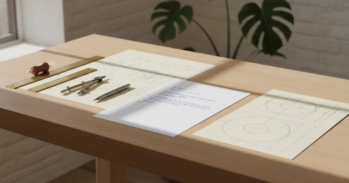
The unlikely origin: a side project born from CSS nostalgia
Oskar Wickström, a developer at TigerBeetle, did not set out to build a product. He set out to spend his weekends in what he calls a “meditative state” writing CSS — and The Proportional Web is what emerged.
The project traces its roots to a confession Wickström makes openly: he has an unexplained soft spot for CSS. He acknowledges the language is weird, confusing, and infamously error-prone, yet the affection persists — likely, he suspects, from nostalgia tied to his earliest days building web applications. That same affection produced The Monospace Web, a minimalist CSS stylesheet he built during downtime just before joining TigerBeetle. The Monospace Web spread further than Wickström anticipated, with personal blogs and application interfaces alike adopting its aesthetic. It became a quiet reference point in developer circles for handcrafted, intentional web styling.
The Proportional Web is its spiritual successor. Where The Monospace Web leaned into fixed-width typographic grids, this new project reaches toward proportional typesetting — and the inspiration is explicitly literary, not technical. Wickström credits Robert Bringhurst’s The Elements of Typographic Style, a canonical text in print design, as the catalyst. Bringhurst’s book treats typography as a discipline of care and proportion, and Wickström carried those ideas directly into the browser.
This matters because the impulse behind The Proportional Web has nothing to do with solving a scalability problem or shipping a feature. It is pure typographic curiosity expressed through custom CSS, the kind of web design work that predates the framework era and sits closer to craft than engineering. Released as v0.1.0 under the MIT license, the project reflects a mode of front-end development that prioritizes visual rhythm and typographic structure — principles borrowed from centuries of print design — over the utility-first, component-driven logic that dominates contemporary CSS practice. Wickström built it on weekends because he wanted to. That origin shapes everything about what it is.
What most coverage misses: this is about craft, not code
Most coverage of The Proportional Web treats it as another CSS toolkit to drop into a project. That framing misses the point entirely.
Oskar Wickström built this as a philosophical statement about what the web can be. The central argument isn’t about utility — it’s about proportion, restraint, and visual harmony as legitimate design goals in their own right. Where modern frontend tooling trends toward abstraction layers, utility classes, and ever-expanding component libraries, The Proportional Web moves in the opposite direction. It asks what happens when web typography answers to the same principles that governed well-made books for centuries.
The anchor text here is Robert Bringhurst’s The Elements of Typographic Style, a book that treats type not as decoration but as a discipline with its own ethics. By building a CSS project explicitly inspired by that work, Wickström is making an implicit critique: that contemporary web design has drifted away from readability and visual rhythm toward complexity for its own sake. The web doesn’t need more features. It needs better proportions.
This mirrors what happened with The Monospace Web, Wickström’s earlier project, which spread across personal blogs and application interfaces far beyond what he anticipated. Developers responded to something they recognized — design that comes from craft rather than configuration. The Proportional Web carries that same instinct forward, this time rooted in print typography’s relationship between type size, line length, spacing, and page structure.
The MIT license and the version number — v0.1.0 — signal exactly what kind of project this is. It’s an open invitation, not a finished product. Wickström is starting a conversation with the developer community about web design principles, not shipping a framework with a roadmap and a Slack channel. The versioning alone communicates humility: this is the beginning of an idea, available for anyone to adapt, critique, or build on.
That openness is itself part of the philosophy. Good typographic design, as Bringhurst argues, serves the reader rather than announcing itself. A CSS project with those values probably shouldn’t launch with fanfare either.
Why The Monospace Web’s unexpected success matters as context
Oskar Wickström did not expect The Monospace Web to land the way it did. The project — a deliberately minimal CSS stylesheet built around fixed-width typography — spread across personal blogs and application interfaces far beyond what he anticipated. That kind of organic adoption, driven by no marketing and no framework ecosystem, signals something real: developers are actively looking for alternatives to complexity.
The Proportional Web is Wickström’s follow-up, and the logic connecting the two projects is direct. If developers responded that strongly to a monospace-constrained design system, the question becomes whether the same appetite for restraint and typographic intention exists when you remove that constraint entirely. Proportional typefaces are the default of the mainstream web. Taking the same craft-first philosophy into that territory is a different and harder problem.
Wickström describes writing CSS in a “meditative state” — weekend hours spent on a side project with no commercial pressure and no sprint deadline. That framing matters. The Proportional Web draws its inspiration from Robert Bringhurst’s The Elements of Typographic Style, a book that treats typography as a discipline requiring judgment and historical awareness, not a problem to be abstracted away. Bringing that sensibility into a CSS project positions web styling as something closer to craft than configuration.
This trajectory fits a wider pattern. Developers across the industry have started questioning whether frameworks like Tailwind, Bootstrap, and their descendants actually reduce cognitive load or simply relocate it. Plain HTML revivals, classless CSS stylesheets, and handwritten design systems have accumulated genuine followings. The Monospace Web becoming a community phenomenon — not through a Product Hunt launch or a venture-backed team, but through word of mouth among people who found it genuinely useful — reflects that same current running through the developer community.
The Proportional Web enters that conversation as a more ambitious experiment: proof-of-concept that thoughtful, opinionated CSS, grounded in typographic principles rather than utility classes, can serve the broader web and not just its monospace corner.
The deeper tension: CSS as a medium for ideas, not just styling
Oskar Wickström calls his relationship with CSS a “soft spot,” then immediately undercuts the romance: the language is “weird, confusing, and infamously error-prone.” That contradiction is the point. CSS earns affection not despite its strangeness but because of what that strangeness demands — patience, specificity, a willingness to think visually before thinking syntactically.
For developers who built their first web pages in the early 2000s, CSS carries a particular emotional weight. It was the first tool that let a programmer make something look like something — that bridged logic and perception. Wickström traces his attachment partly to nostalgia from those early years of writing web applications, and that origin story matters. It means the feeling predates Tailwind, predates Bootstrap, predates the entire ecosystem of utility-first and component-driven frameworks that now dominate front-end work.
What projects like The Proportional Web and its predecessor The Monospace Web argue, implicitly, is that CSS is a creative medium with its own grammar — closer to typography and print layout design than to conventional programming. Wickström didn’t reach for a design system when inspiration struck after reading Robert Bringhurst’s The Elements of Typographic Style. He sat down and wrote CSS by hand, in what he describes as a “meditative state.” That phrase signals something important: the process itself carries value, not just the output.
This framing cuts directly against how AI-assisted web design tools currently operate. Tools that generate CSS from prompts or visual inputs optimise for speed and functional correctness. They produce layouts that work. What they routinely sacrifice is typographic integrity — the deliberate relationships between type scale, line length, spacing, and proportion that Bringhurst spent a career articulating. A language model completing a stylesheet has no investment in the rhythm of a text block or the optical weight of a heading. Wickström does.
The Monospace Web spread to personal blogs and production application interfaces — clear evidence that handcrafted CSS, when it embeds real design thinking, resonates beyond the developer who wrote it. The appetite for web design rooted in craft and intentionality is not nostalgic indulgence. It is a response to interfaces that increasingly look generated because they are.
What The Proportional Web signals about where web design is heading
Oskar Wickström’s The Proportional Web is a small CSS project. What it points toward is not small at all.
The web is filling up fast with AI-generated interfaces — layouts assembled by tools that optimize for speed and consistency, not craft. The result is a flattening: navigation bars, card grids, and sans-serif type stacks that look interchangeable across thousands of sites. Against that backdrop, a design system rooted in Robert Bringhurst’s typographic principles reads less like nostalgia and more like a deliberate act of resistance.
Wickström’s earlier project, The Monospace Web, demonstrated real appetite for this kind of intentional, hand-authored CSS. It spread beyond personal blogs into application interfaces — adoption that Wickström himself described as far exceeding his expectations. That trajectory matters. Developers and designers picked it up not because a framework told them to, but because it offered something frameworks rarely do: a coherent visual philosophy.
The Proportional Web doubles down on that philosophy. By anchoring web typography to classical print tradition — the same tradition that shaped book design for centuries before the browser existed — it argues implicitly that legibility and longevity outrank novelty. The principles in Bringhurst’s work survived the transition from hot metal type to desktop publishing. Wickström is betting they survive the transition from handcrafted HTML to AI-generated markup too.
For anyone outside the web development world, the practical implication is straightforward. The next generation of distinctive, well-crafted websites may draw inspiration from books rather than mobile apps. Generous whitespace, proportional type scales, deliberate column widths — these are the marks of considered typographic design, and they are the opposite of what automated interface generation currently produces.
Human-authored design systems grounded in classical proportion will not replace AI tooling. But they will increasingly stand apart from it. In a web where templated uniformity is the default, craftsmanship becomes visible precisely because it is rare. The Proportional Web is one signal of that shift. It probably will not be the last.